Angel City Stitchery
Angel City Stitchery is a new brick-and-mortar needlepoint shop in Los Angeles, created as a tribute to the owner’s grandmother, who introduced her to the craft. Working as a part-time Senior Designer with Gartin Print Co., I collaborated with Emily Moenning to develop the brand from the ground up; starting with a story and a blank slate.
The goal was to create an identity that felt warm, handmade, and approachable while paying homage to both the tradition of needlepoint and the spirit of Los Angeles. We explored earthy color palettes, hand-drawn elements, and a visual language designed to welcome all ages and experience levels without feeling overly precious or intimidating.
I developed multiple initial concepts before narrowing the direction with Emily for client presentation. From there, we collaborated on the final identity and brought it to life across colorways, packaging, merchandise, and website design.
Design Concept 1
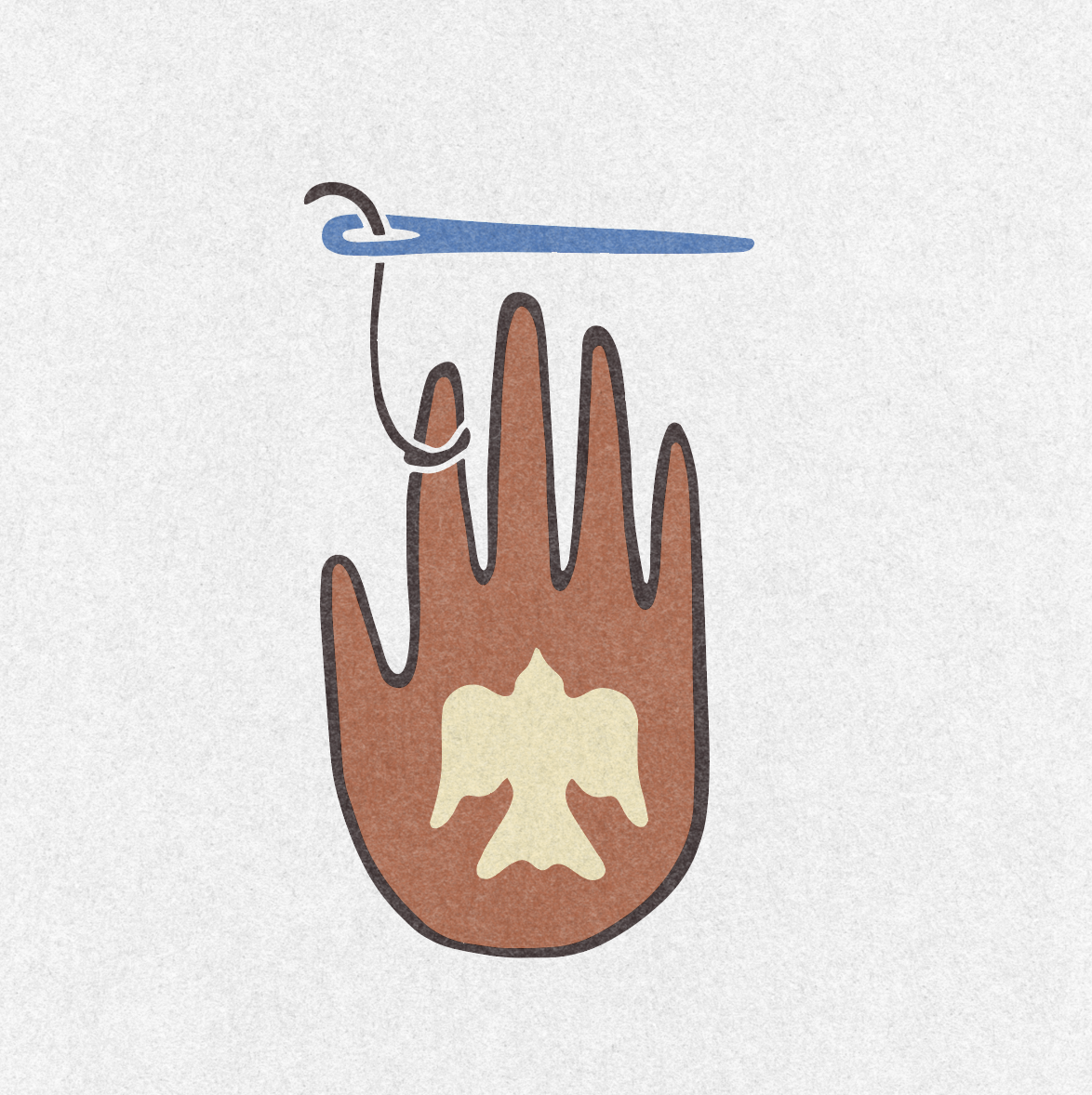
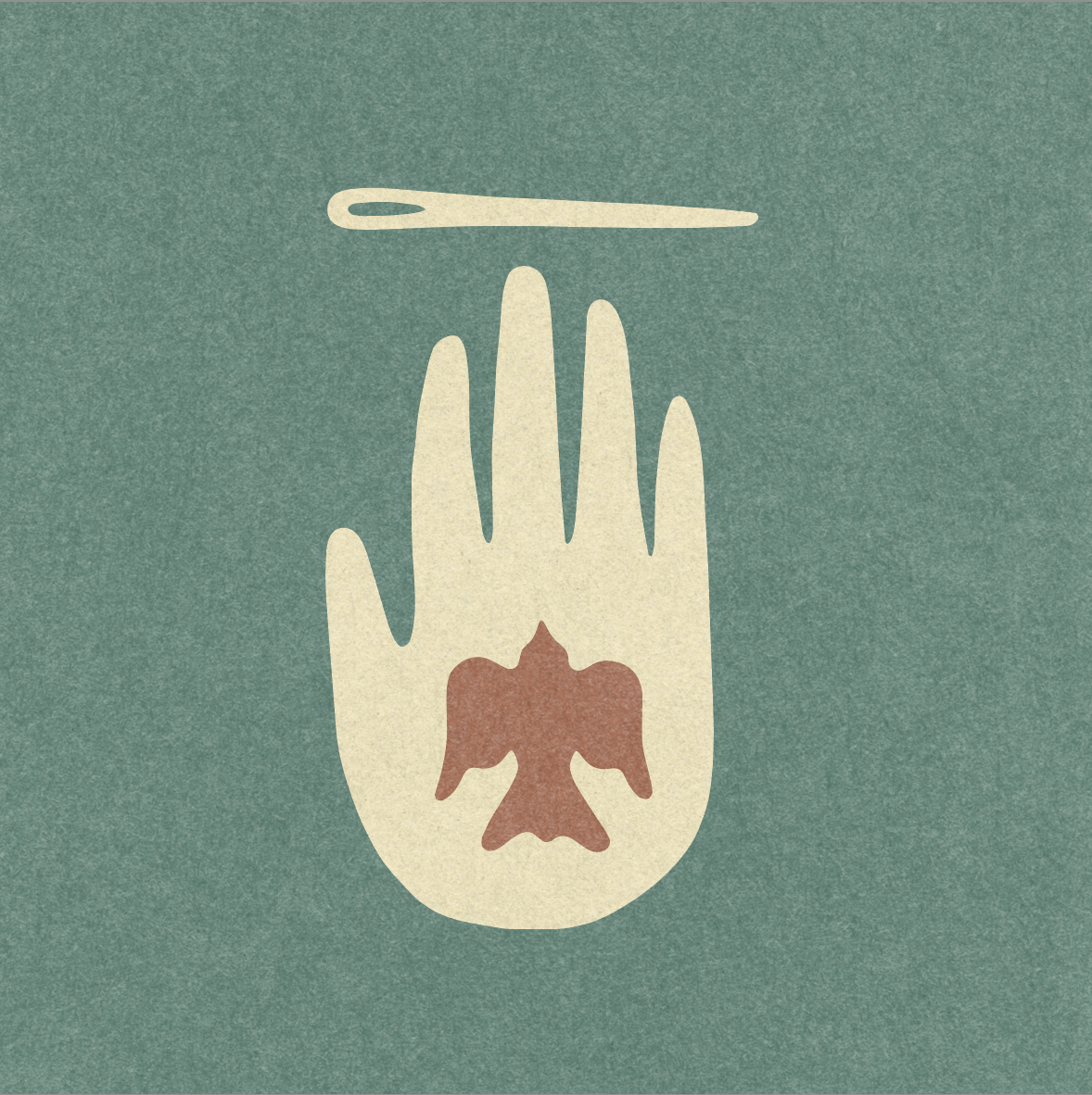
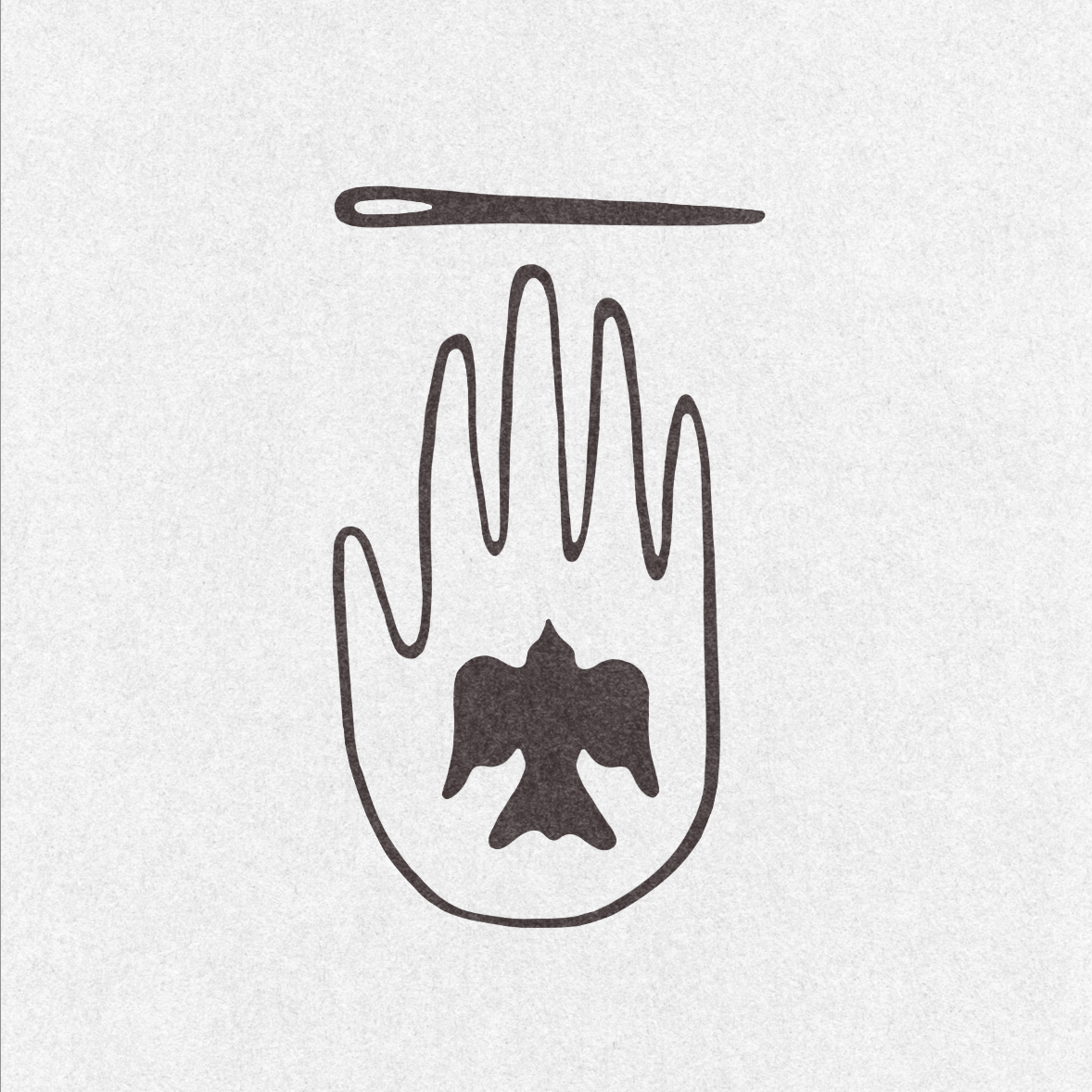
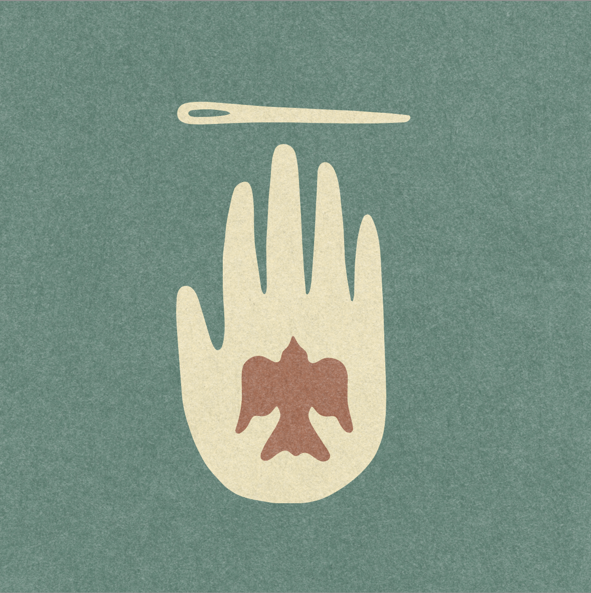
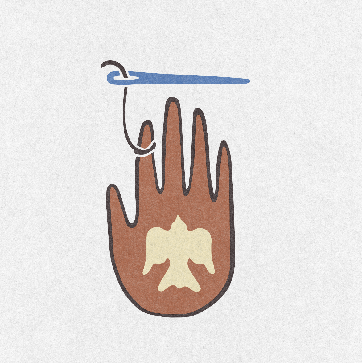
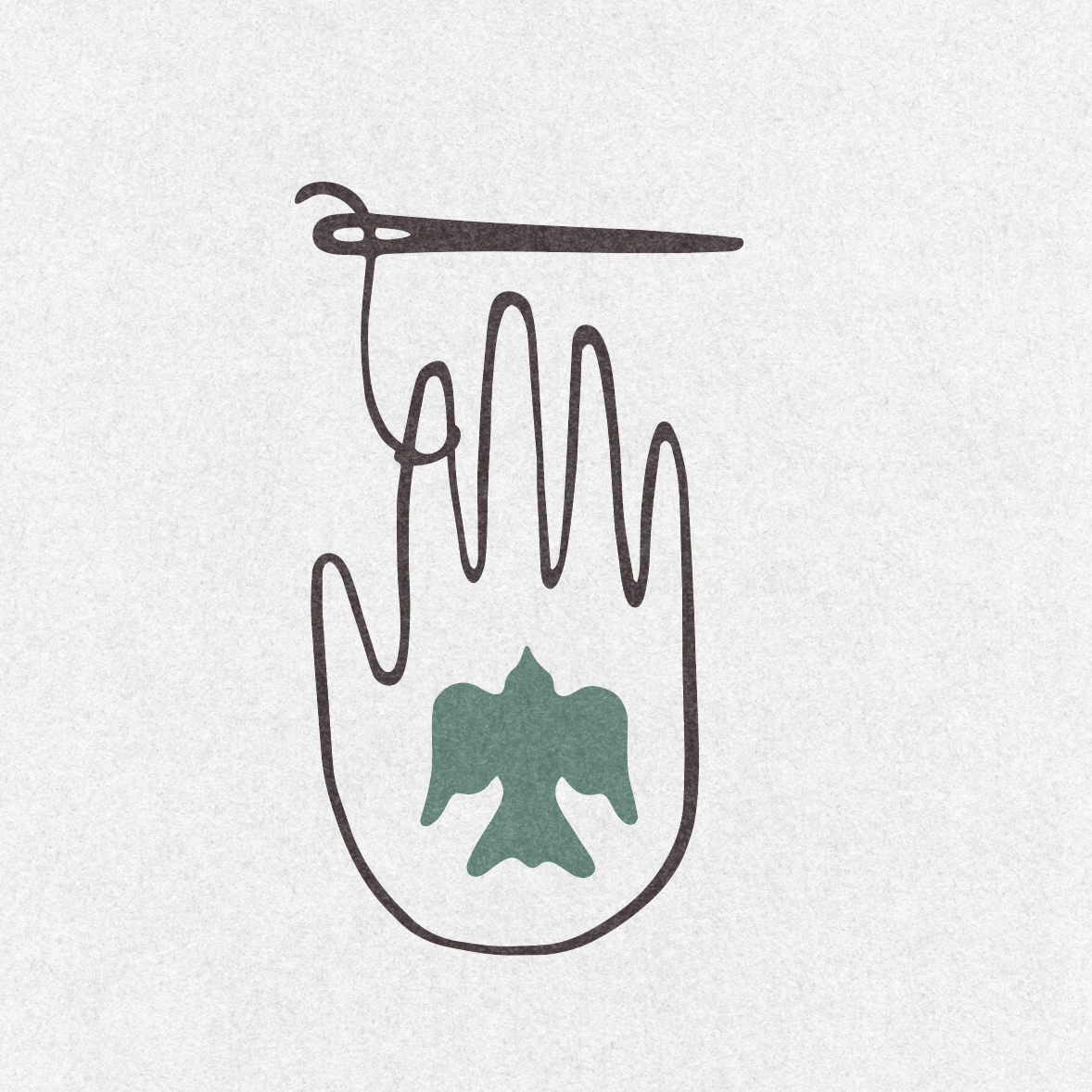
This concept centered around a hand-drawn open palm, with a bird nestled within the hand and a needle floating just above it. Some iterations kept the needle independent, while others introduced a thread connecting the needle back to the pointer finger.
The hand became a symbol of connection, care, and the tactile nature of needlepoint. The thread reinforced that idea, ultimately creating a visual relationship between the maker and the craft. The bird added a sense of freedom and spirit, while the overall imagery felt subtly spiritual without feeling overtly religious.
The earthy, hand-drawn quality also spoke to the founders’ love of natural, organic forms and helped establish a brand that felt personal, welcoming, and a little unexpected. Rather than positioning needlepoint as a precious or traditional craft, the concept aimed to make it feel intuitive, expressive, and deeply human.
Design Concept 2
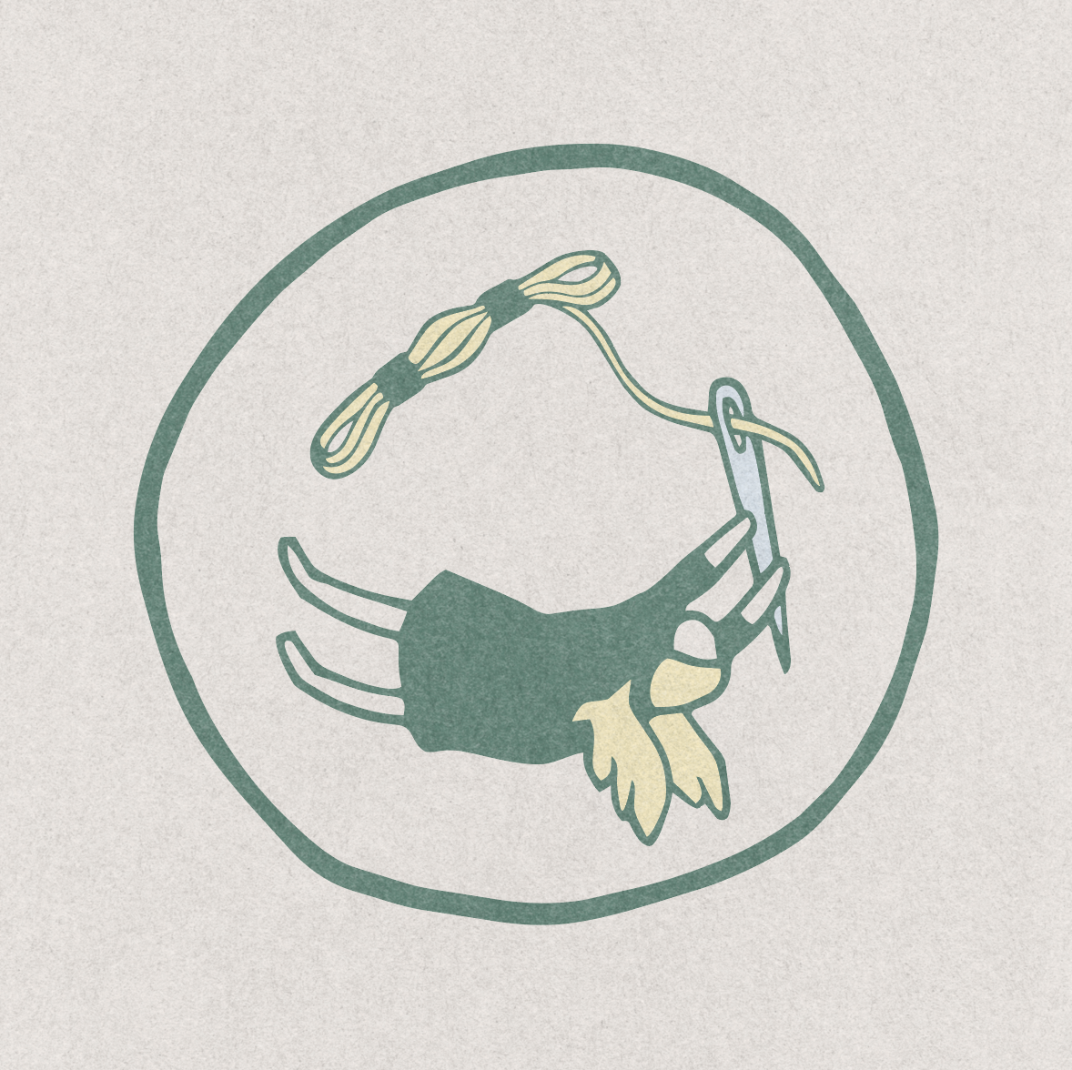
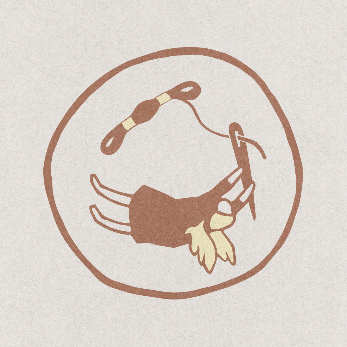
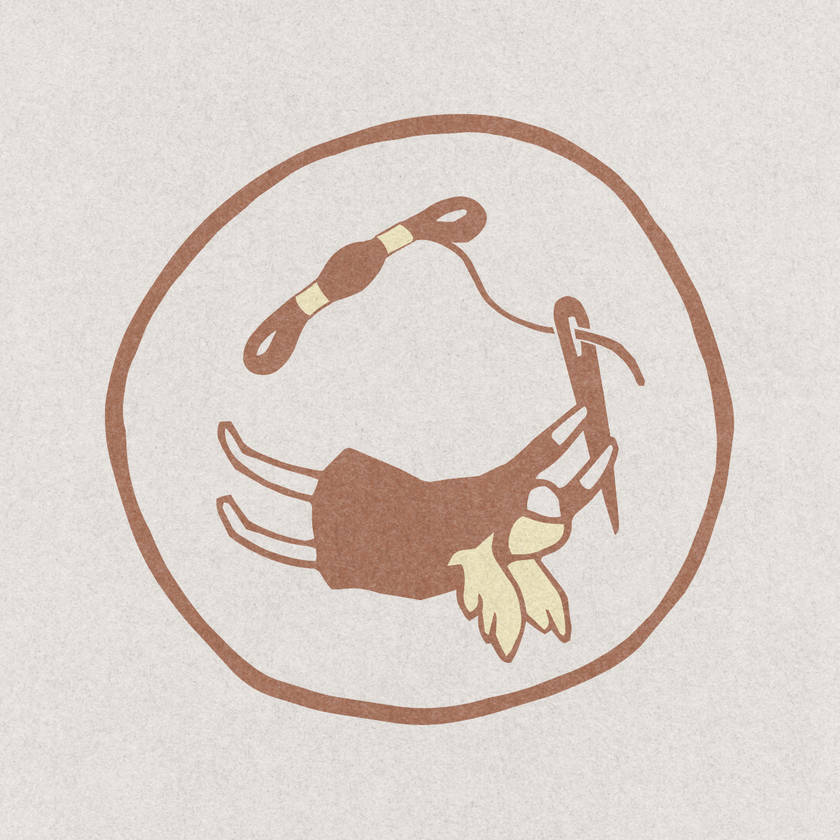
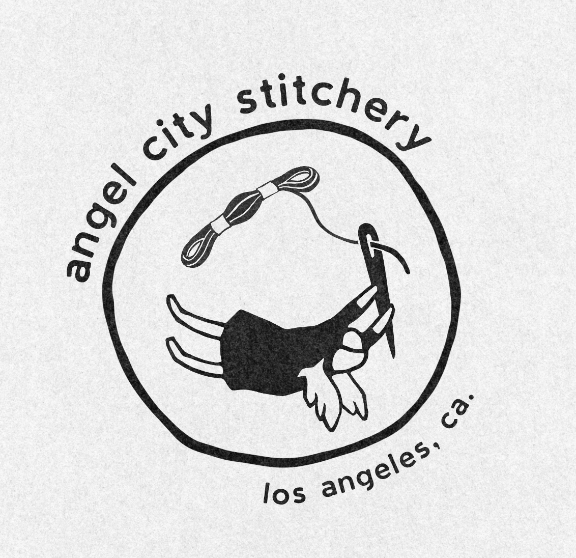
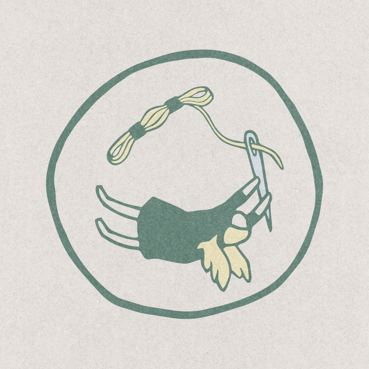
This concept explored a more playful interpretation of the “Angel” in Angel City Stitchery. A hand-drawn, non-binary angel figure sits within an imperfect organic circle, spinning in the same direction as the form while holding an oversized needle. The thread flows from the needle around the circle and into a spool, creating a continuous visual loop that ties the character directly to the craft.
The intentionally imperfect circle and loose illustration style gave the concept a childlike quality that made it feel immediately approachable and unintimidating. At the same time, the styling was kept modern and graphic enough to feel charming rather than juvenile.
I especially liked the idea of the angel as a playful archetype rather than a religious figure. Without a halo or traditional religious cues, the character became more of a friendly symbol, or even a potential mascot, for the brand. It gave Angel City Stitchery a personality that could extend beyond the logo and become part of the larger visual identity.
Final Design Concept
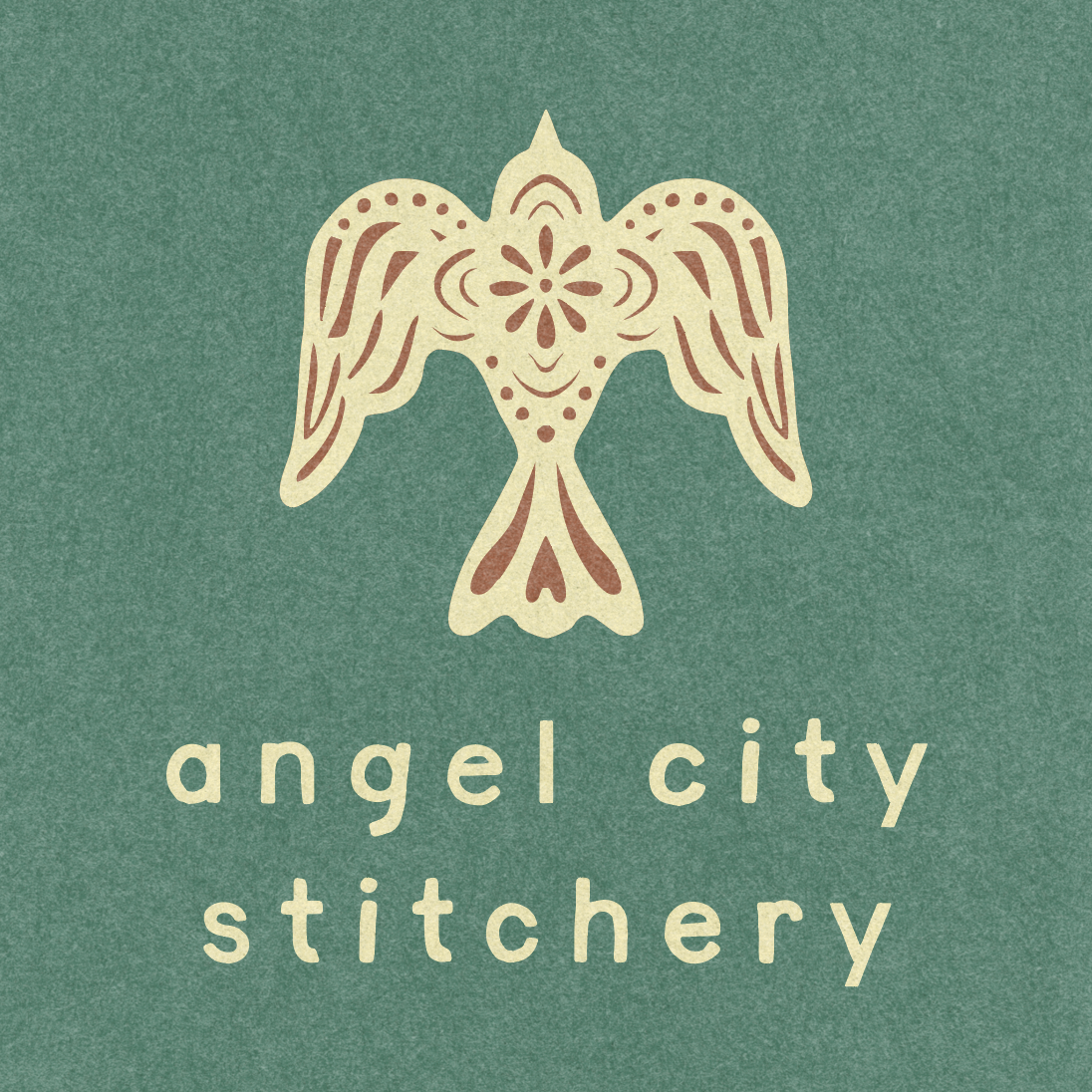
The final identity emerged as a collaboration between the client’s favorite elements from both initial concepts. They loved the bird as a representation of the “angel” in Angel City Stitchery, while also responding to the playful illustration style and imperfect organic shapes of the second direction. Together, these ideas became the foundation for the final brand.
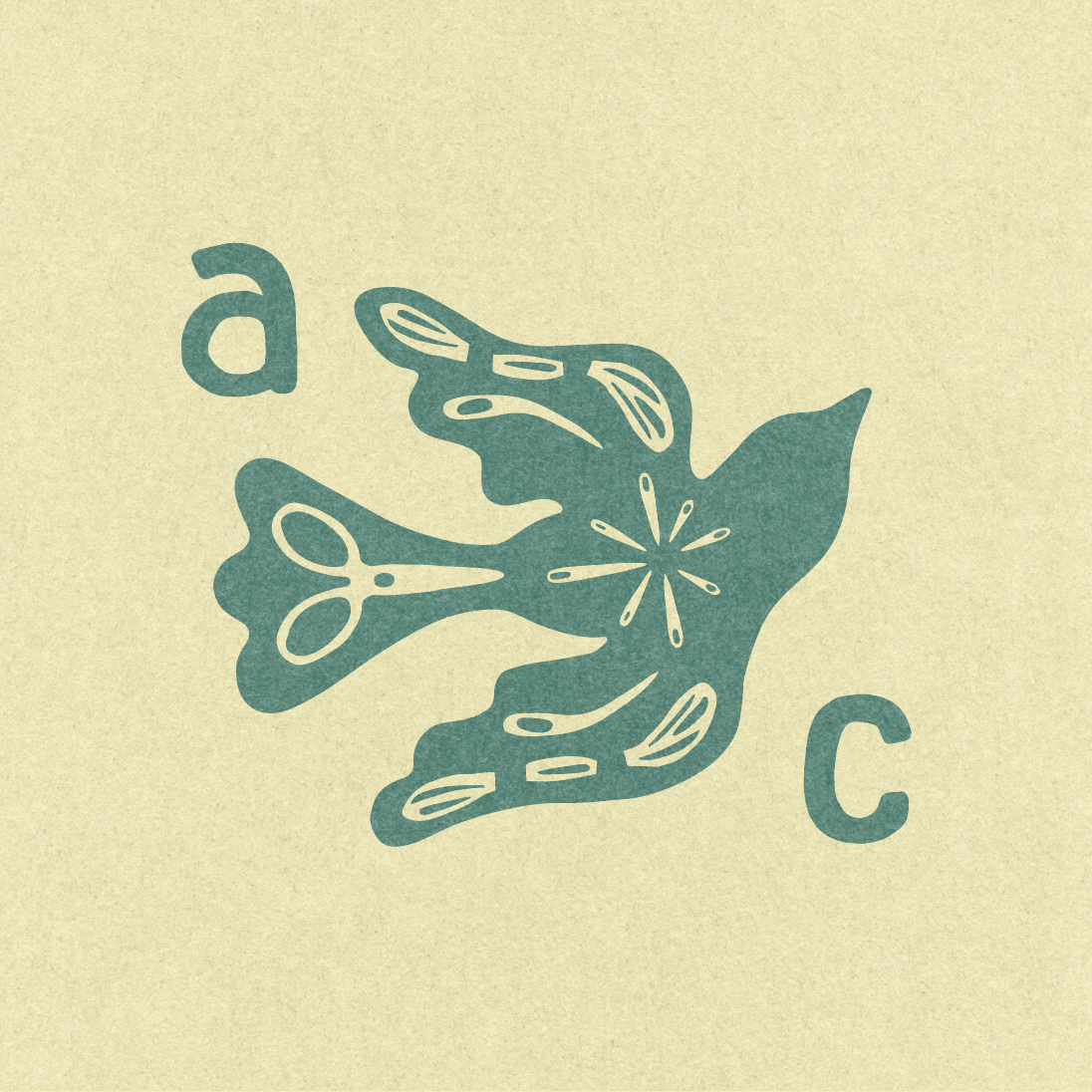
We explored numerous interpretations of the bird: flying, upright, in profile, from above, and in different poses, alongside multiple wordmark and logo configurations. I collaborated closely with Emily throughout this process to refine the system and find the right balance of personality, movement, and simplicity.
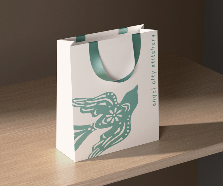
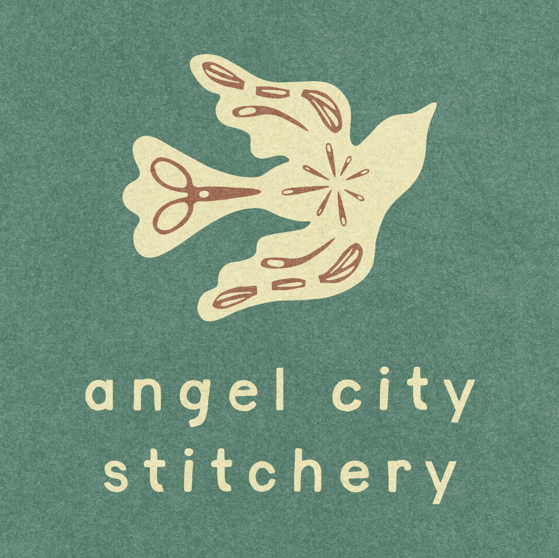
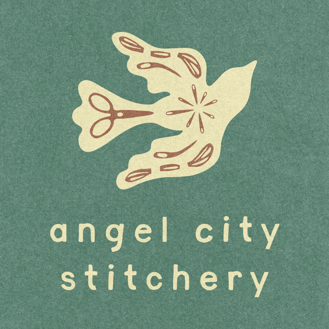
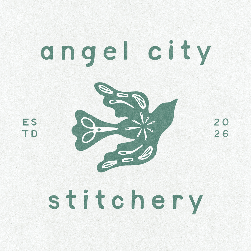
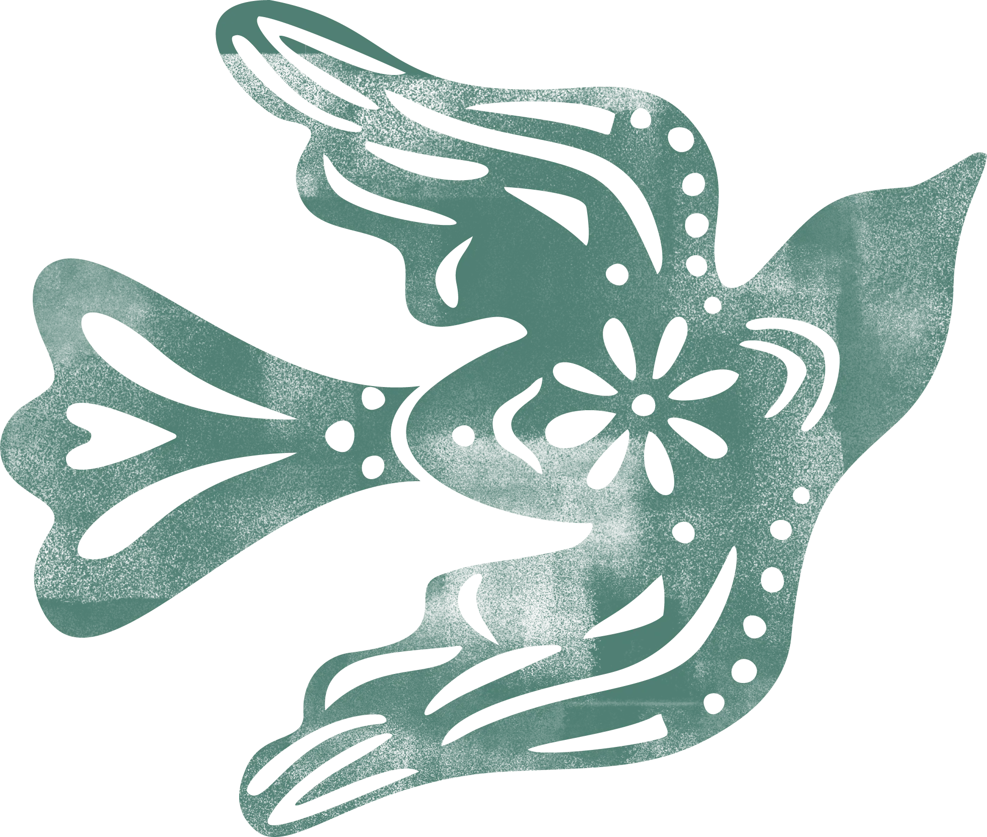
Emily introduced stencil-like cutouts into the bird, incorporating tiny references to the craft such as needles, scissors, and needlepoint-inspired shapes. These details transformed what could have been a simple, solid silhouette into a more distinctive and ownable mark. The bird’s flowing form also brought a natural sense of movement and energy to the identity.
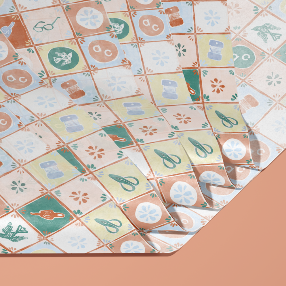
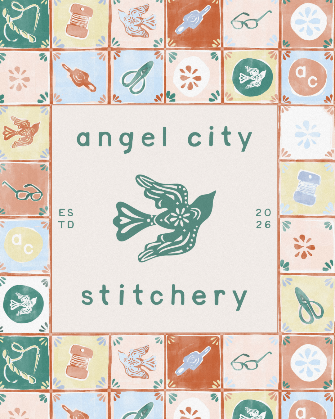
From there, we expanded the system beyond the primary logo, using the bird illustrations, shapes, and color palette to create custom tissue paper patterns, digital assets, and other brand applications. The result was an identity that felt handmade and approachable while giving Angel City Stitchery a visual language that could grow with the brand.

Brand Applications
With the identity established, we brought the system into the physical world of Angel City Stitchery.
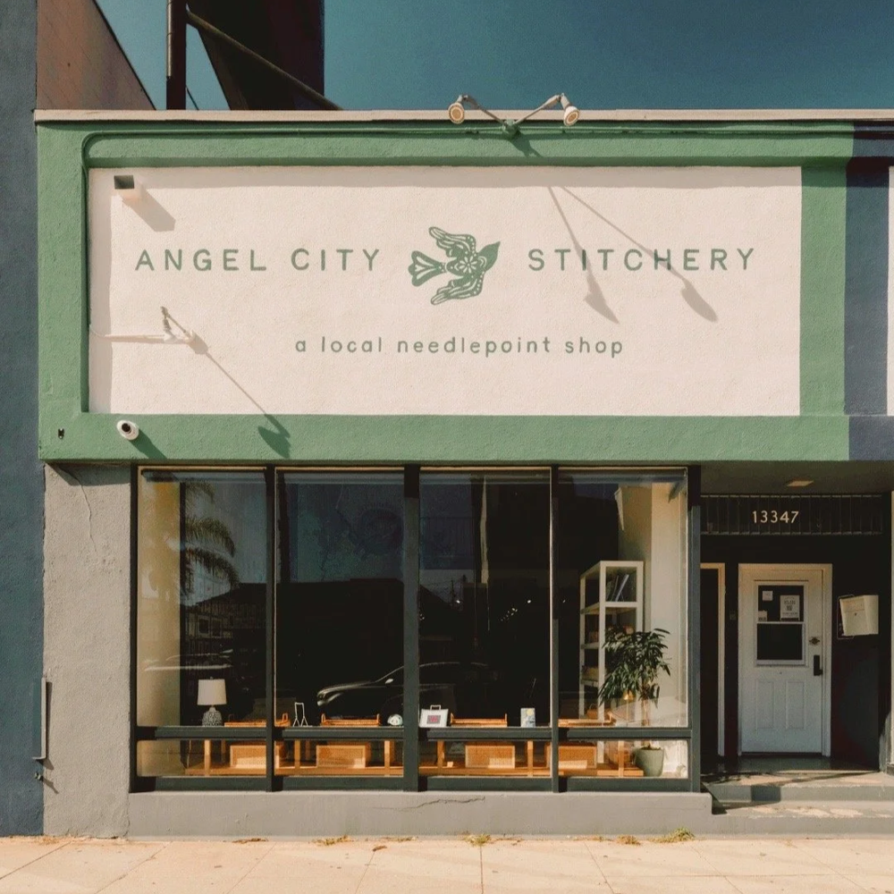
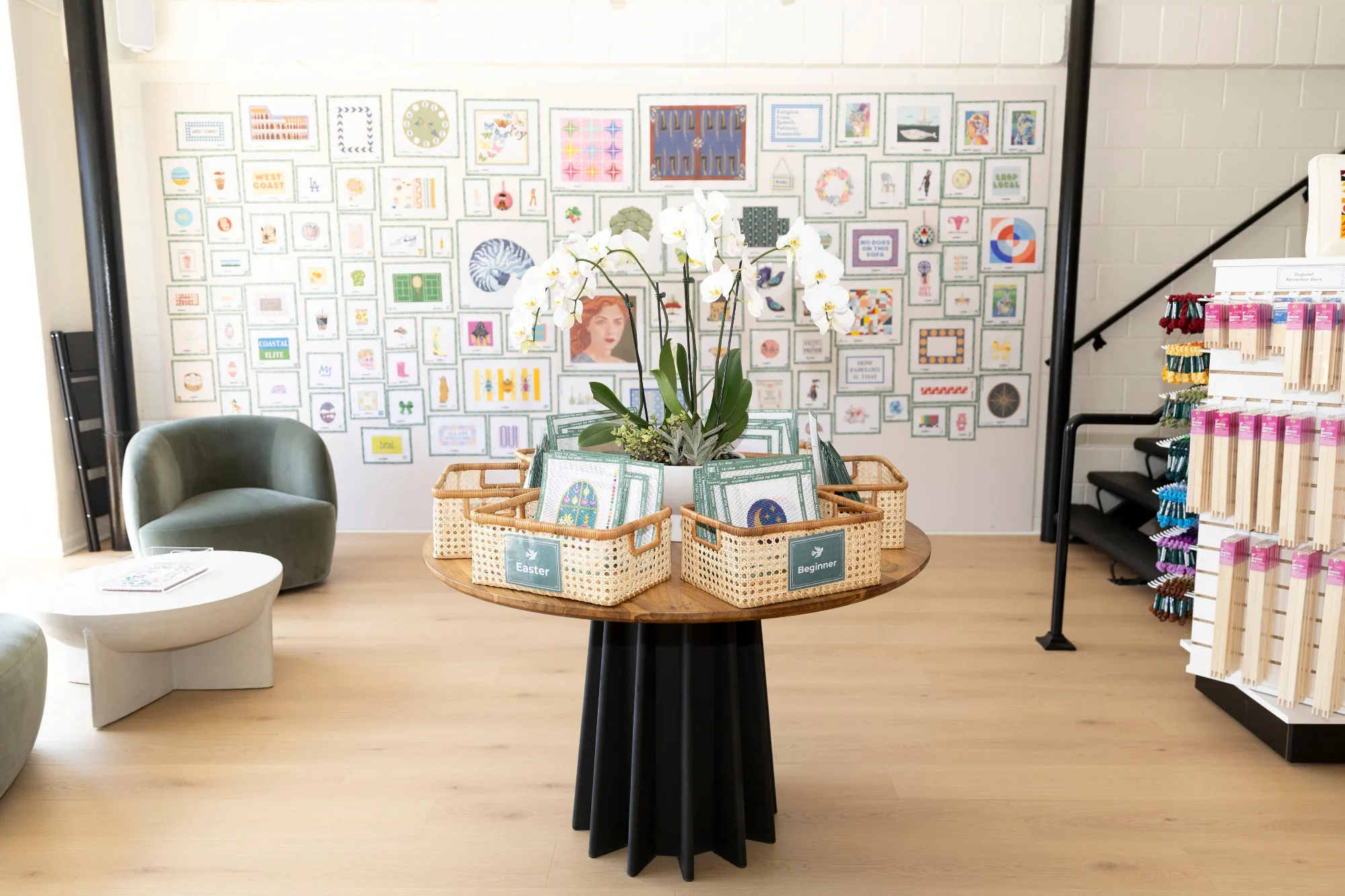
The hand-drawn logo and wordmark became part of the storefront signage, while the color palette, bird illustrations, and graphic elements carried throughout the interior and customer experience.
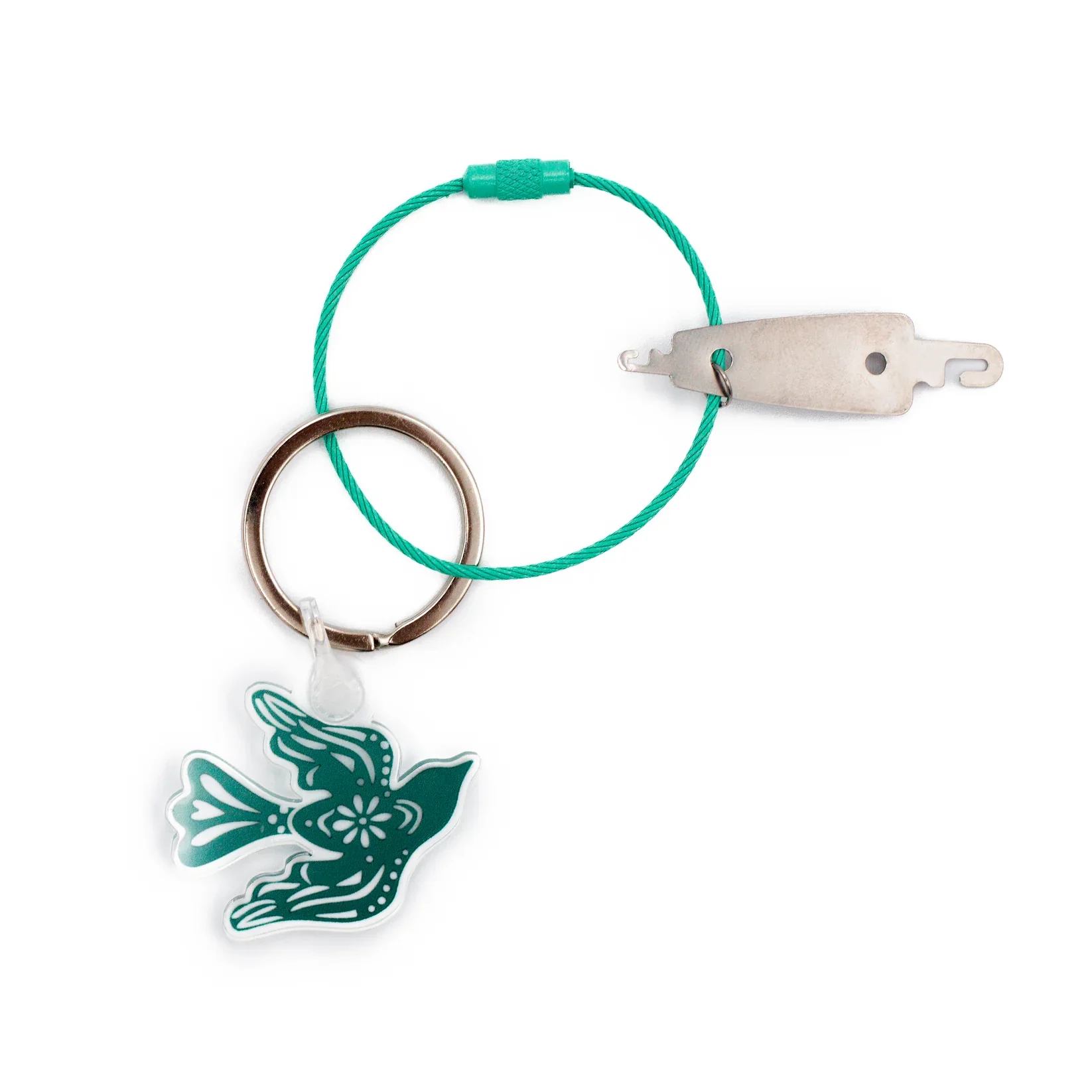
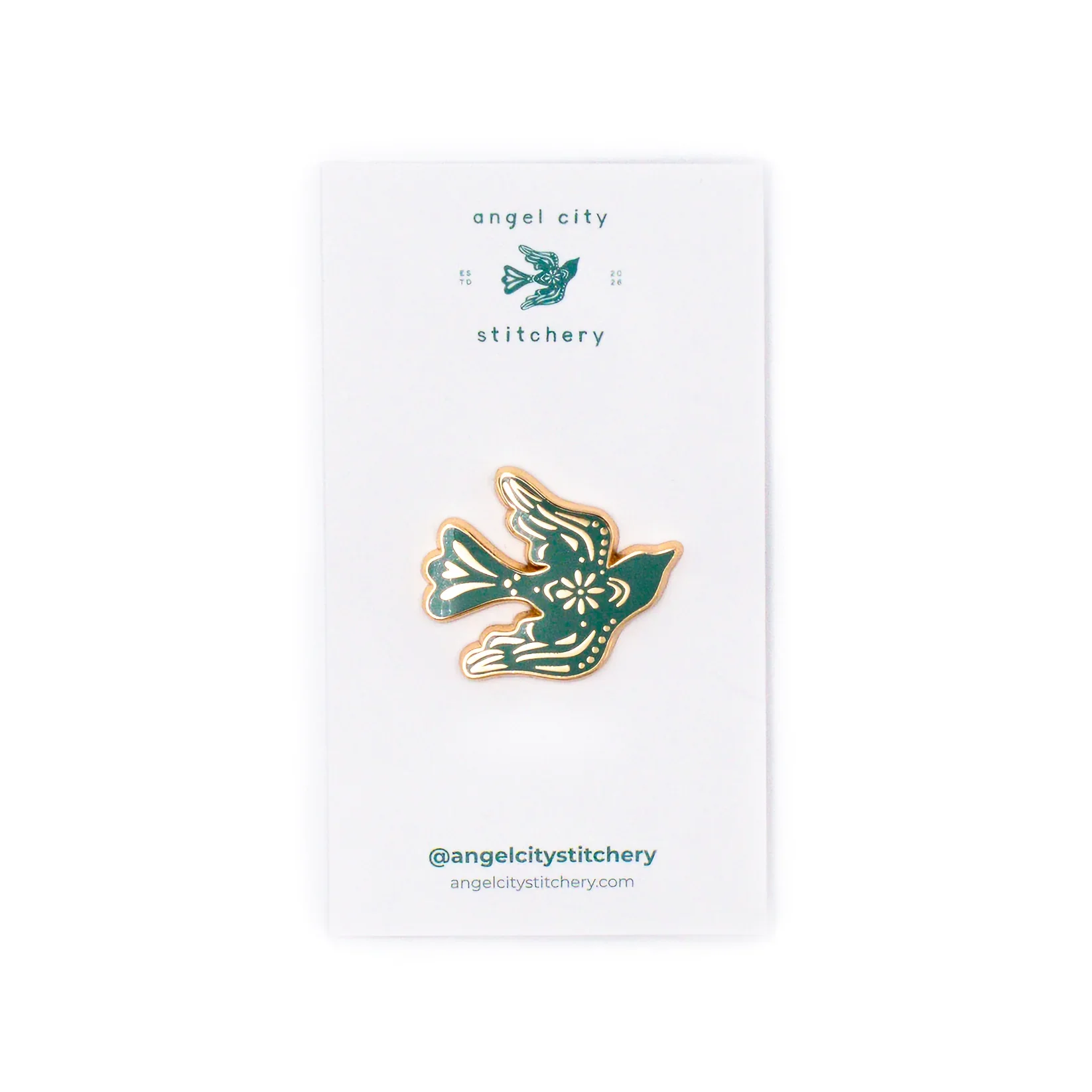
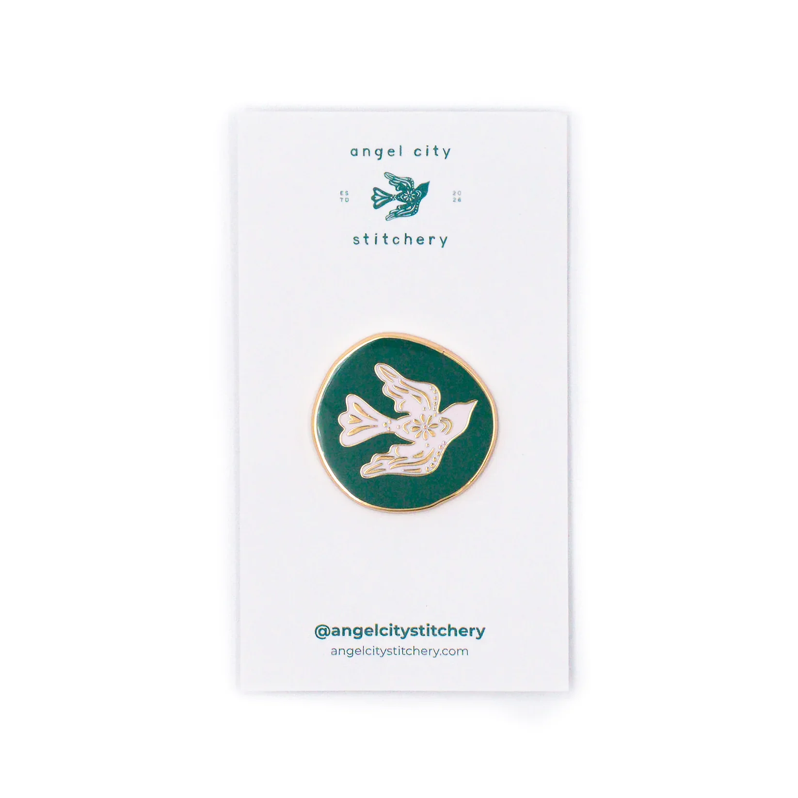
From shopping bags and custom tissue paper to enamel pins and a keychain, each touchpoint gave the brand another opportunity to feel personal, playful, and connected to the craft. These applications allowed the identity to move beyond the logo and become part of the experience of visiting the shop.